
Depok-The Multimedia Broadcasting study program, Vocational Education Program, Universitas Indonesia (UI), held an online seminar entitled “Infographics 101: Interesting Data Visualization” on November 11, 2024 which was attended by Multimedia Broadcasting study program students. The seminar presented Fajri Ma’rifatullah, a presentation coach and data storyteller. Fajri is an expert in the field of presentation and infographic creation. Currently, Fajri has a company that focuses on working in the presentation field, namely Bengkel Slide.
Head of the Department of Applied Social Humanities, Dr. Budiman Mahmud Musthofa, S.Sos., M.Si., in his speech said that this seminar will improve students’ ability to create infographics. “Through infographics, students are able to change information to be more creative and unique when read. I hope they can absorb the knowledge given by Mr. Fajri and apply it in everyday life,” said Budiman.
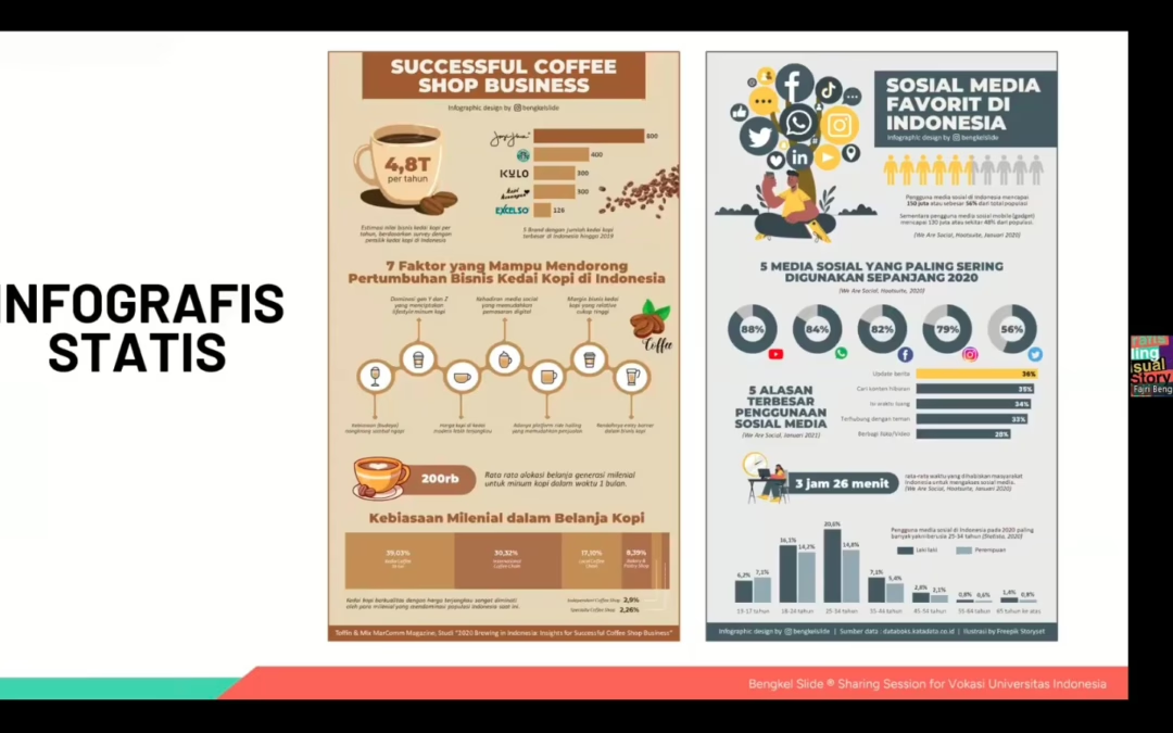
Fajri explained that infographics are visuals that make important and complex information easier to understand. There are various types of infographics, ranging from statistics, timelines, flow/processes, comparisons, geography, to listicles. “These various types of infographics can be used according to their respective needs. For example, geographic infographics for interesting tourist attractions in Indonesia or timeline infographics to show the schedule and stages of the 2024 Election,” explained Fajri.
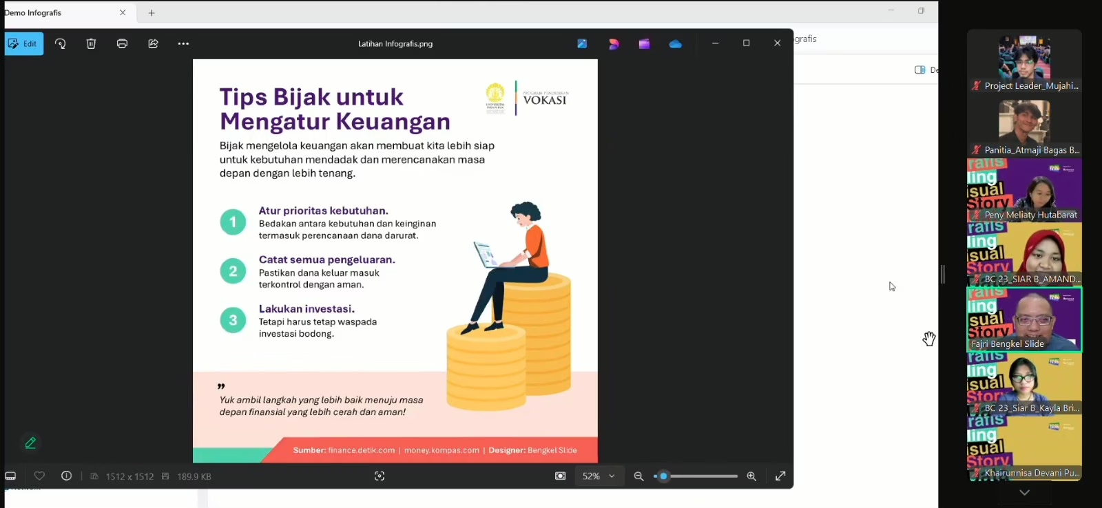 (Photo: Fajri gives a demo of making interesting and informative infographics)
Fajri also explained the structure contained in the infographic. Starting from the title, background information, main information, conclusion or invitation, and source of information or news. In addition, in an infographic there are three important elements, namely color, font, and illustration. Color psychology shows that warm colors describe feelings of cheerfulness, relaxation, enthusiasm, and passion. Meanwhile, cool colors describe feelings of seriousness, formality, professionalism, and elegance. Color determination can be adjusted to the logo, product, and website.
Furthermore, Fajri explained that the optimal use of fonts in infographics is only two, and a maximum of three. Fonts can also describe the character of the infographic you want to create, for example Serif fonts (such as Georgia, Book Antiqua, Times New Roman) are formal and rigid, then Sans Serif fonts (such as Arial, Segoe UI, Tahoma) are modern and dynamic, and Display fonts (such as Lobster, Monotype Corsiva, Brush Script) are for.
Fajri added that the sentences listed in the infographics should be easy to read and understand. Fajri said, “The text in the infographics should not be too long and the size should not be too small. In addition, the use of good and correct language, and the distance between the writing is not too close. Finally, capital letters will provide emphasis and formality. Meanwhile, lowercase letters provide a flexible, friendly, and dynamic nature.”
 (Photo: Fajri explains the supporting elements in making an infographic)
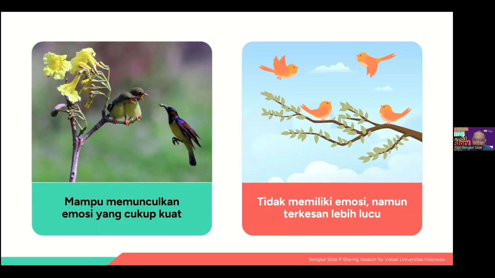
The last element is illustration. Fajri divides it into two types of illustrations, namely in the form of realistic photos and icons/vectors. Illustrations with realistic photos are able to bring out quite strong, professional and formal emotions, but have limitations in visualizing messages. Meanwhile, illustrations with icons/vectors do not have emotions and seem funnier, more modern, informal, and more flexible in visualizing messages.